User experience is not a design issue in the early days of product development, but it is a strategic differentiator. Having a good MVP user experience may be what encourages your initial users to remain, convert, and refer. On the downside, a bad MVP will be immediately churned, receive negative feedback, and lose the chances of validation.
Friction reduction, simplified onboarding, and testing key interactions in the real world: in the fintech and crypto world, where trust, clarity, and speed matter the most, a UX-based MVP can assist startups in starting with reduced friction, making onboarding as simple as possible, and testing key interactions in real-world conditions. And it is not to provide a completed, feature-laden product but to just ship something workable, trainable, and lovable at its core.
How can teams create effective software UX design with lean resources and tight timelines? The solution is simplicity of functionality with a user-first MVP mindset. This means reduced functionality, increased testing, and a planned feedback and improvement plan.
We shall also discuss how a carefully designed software usability MVP can assist a team to win over early users, establish product-market fit sooner, and provide groundwork to grow efficiently at scale without undermining the user experience in this article.
Why UX Matters in MVP Development
Creating a feature-complete product is pointless when the users drop off the first time they use it. That is the reason MVP user experience should be considered immediately. At the MVP level, user experience when engaging with your product, be it a crypto wallet or fintech dashboard, has a direct impact on the adoption, retention, and revenue potential.
An MVP that is UX-oriented is not about visual perfection. It has something to do with clarity, responsivity, and emotional comfort. It guarantees users the ability to get what they want in the shortest time and as easily as possible- even when the product is in its early stages.
Aligning UX Goals with MVP Scope
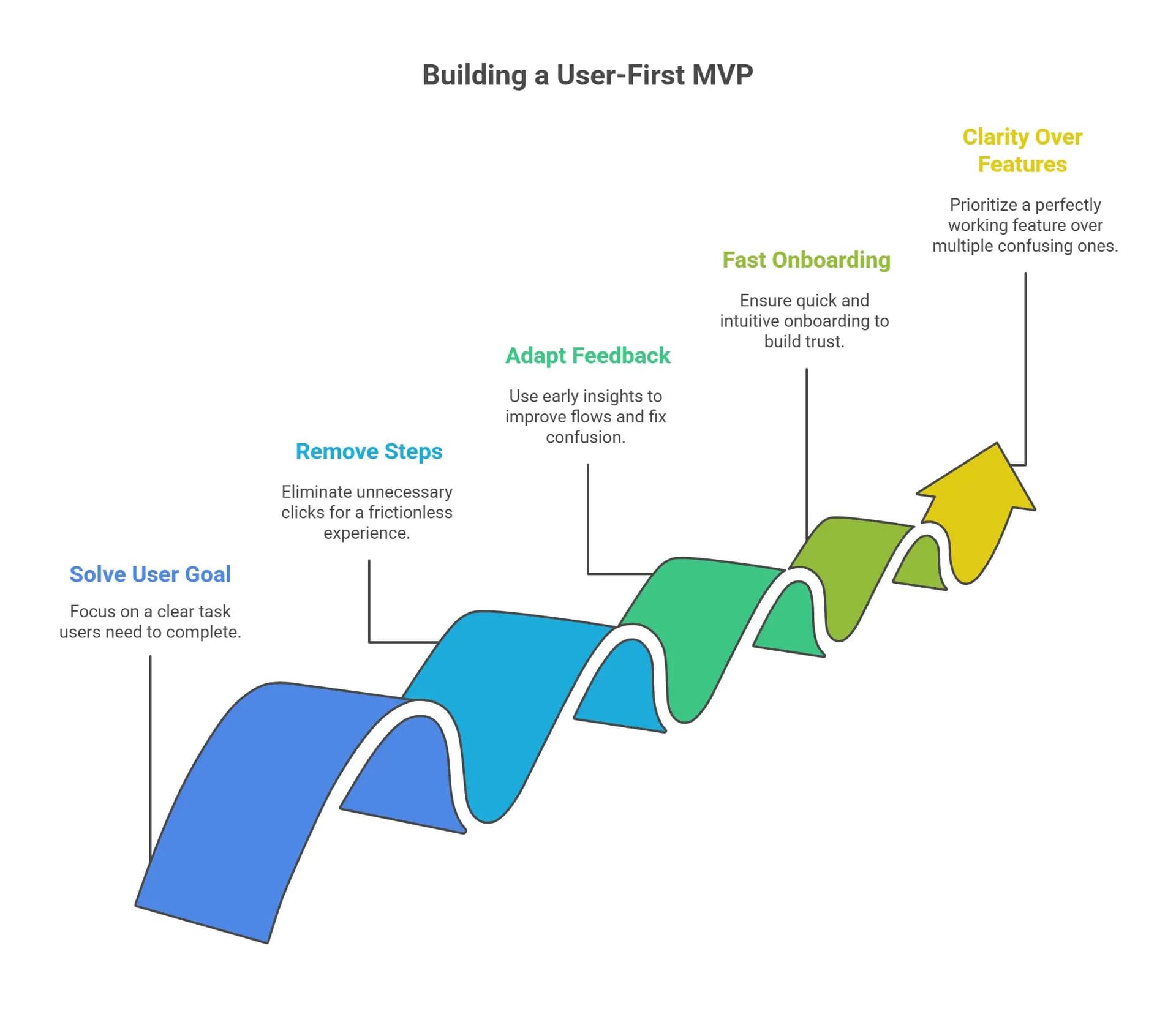
There is an urge to attempt to do everything simultaneously, but the truth of any successful UX is that you can achieve little by focusing on nothing. A user-first MVP has one high-value action: a transfer of funds, a trade, identity verification, etc. That action should be easy to do, and thus your UX must be built around it.
To align UX with the scope, place emphasis on:
- One core user journey.
- Few touchpoints and as clear as possible.
- Simple flows, progress indicators, and tooltips.
Adding features is unnecessary, but can be used to refine interactions until they become intuitive. That is what keeps users occupied.
Common UX Mistakes in MVPs and How to Avoid Them
Startups are known to trade off UX in favor of speed--and it shows. Yet even a simple software usability MVP can be superb when you do not fall into the usual traps.
Mistakes to watch for:
- Weak CTAs or cluttered screens.
- Lacking loading states or error messages.
- Complicated onboarding or sign-up.
- None of the user feedback options helps.
Quick wins:
- Respond with skeleton screens or spinners.
- Write goal-oriented microcopy (e.g., "send payment" vs. submit)
- Create mobile-first, particularly when it comes to financial applications that will be used by international users.
A lean MVP, with a simple UX, can perform better than a heavyweight app with a bad UX, particularly when your users are stressed, in a noisy environment, or technologically skeptical.
Even a basic MVP can (and must) provide a user experience benefit. Overlooking UX this early will lead to early adopters being lost, product validation being skewed, and the cost of redesigning rising. An MVP with a UX focus establishes clarity, trust, and satisfaction, leading to retention and referrals, which are the most important indicators of any fintech or blockchain product at its initial stage.
Startups begin with a user-first MVP approach to product creation that provides the foundation to grow sustainably and ensure ultimate product value. Good UX is not a question of making things more complex, but rather eliminating friction.
Key Principles of UX-Focused MVPs
An effective UX-oriented MVP is better than a functional prototype: it is a streamlined experience that focuses on assisting users in completing one specific task with a minimum amount of friction. In particular, with fintech or blockchain applications, where actions are entangled with trust, clarity, and often money, even the first iteration must provide intuitive value.
It does not aim at perfection, but usability. MVP must be light but not flaky, based on actual user requirements and distilled design thinking. Those concepts assist in converting initial feedback into forward-oriented refinements that narrow down the fundamental user experience as time goes by.
Using UX Research to Shape MVP Features
UX research provides clarity to teams before they write a single line of code to build what matters. This does not involve months of interviewing; maybe a few target-user conversations, short surveys, or usability tests can reveal what your users hope to see, fear, or know (that is, can know).
The advantages of lean UX research are as follows:
- Determines the essential step to be taken by the users.
- Helps put features first.
- Words that terminology users are not comfortable with.
The output? A better user-first MVP that addresses an actual problem, not on day one, but not on the second day.
Balancing Functionality and Usability
Pressure to add features is always present, but in MVPs, more is not better. When there are too many interactions vying to capture attention, usability usually becomes compromised. Rather, optimize focus: choose one key user outcome and make sure your UX can get the user there with minimal effort.
UX/functionality balancing tactics:
- Hide unnecessary options with progressive disclosure.
- Navigation should be kept clean, even when the number of screens is limited.
- Write microcopy that creates expectations (this will take 30 seconds).
A balanced MVP provides only what is useful enough to be of use. And that is how you get a really effective software usability MVP.
All choices in MVP have to be based on user value. Having a high-quality MVP user experience means having less friction, making things clearer, and pointing users in the correct direction where one outcome is achieved. By prioritizing usability rather than complexity, teams foster trust and learn faster and faster, and create conditions to sustain product success in the long term.
What Makes a User-First MVP? Find out effective answers.
Software UX Design Techniques for MVPs
It takes more than just a few lines of code to create a quality user experience in MVP, and it takes considered design decisions that focus on usability, clarity, and rapid time to learn. An MVP that is UX-friendly will enable teams to test core flows, remove confusion, and iterate on actual interactions.
Instead of concentrating on the aesthetics of the entire product, the initial design should be directed at the clarity of navigation, mobile reactivity, and onboarding. These aspects have been crucial in the world of fintech and blockchain, and a single UX glitch can mean loss of trust or failure to transact.
Designing for User Onboarding in MVPs
It is during onboarding that first impressions are formed- and usually lost. Onboarding flows must help users feel at ease during initial setup and with essential actions, even in an MVP.
Major UX principles for onboarding MVPs:
- Follow plain step-by-step flows with illustrations.
- Provide tooltips rather than tutorials.
- Show success messages and error messages.
- Allow users to test the essence of the application and then fully sign up (where applicable).
This should minimize hesitation and mental burden- the two concepts of a successful software usability MVP.
Testing and Iteration with Real Users
Design is by no means final—particularly in MVP. Users who use your prototype or beta version in real life will reveal areas of usability and point to areas needing improvement. This is why you need to include lightweight testing in your design loop.
Test early and often using:
- Prototypes to test flows: clickable style (Figma, InVision).
- Guerrilla usability testing of 5-10 users.
- Recordings of the session and heat maps to see friction.
- Microcopy or CTA placement A/B tests.
These practices make certain that your user-first MVP will develop with evidence rather than assumptions.
Good UX does not have to be costly or time-consuming. Simple design tools, targeted testing, and a lean attitude are all that any startup needs to create an impressive software UX design base. During the MVP, there is no need to impress users with the level of polish, but instead, enable users to take action with confidence.
Tools That Improve Software Usability MVP
Having a smooth interface is not important when people find it hard to accomplish something. This is why it is critical to choose the appropriate tools to provide a seamless MVP user experience. Whether you are trying out a fintech onboarding flow or prototyping a crypto dashboard, research, prototyping, analytics, and user testing tools help teams to quickly and intelligently refine design.
These platforms simplify the process of making UX-centered MVP choices and transform them into scalable and production-ready interfaces- without straining your resources.
Feedback-Driven UX Adjustments
The basis of any user-first MVP is feedback. The quicker you can gather, arrange, and respond to it, the more timely your UX will be.
Suggested instruments to use in collecting feedback:
- Hotjar – Heatmaps and session replays—can help to visualize where users click, scroll, or drop off.
- Typeform – Perhaps the simplest survey to add to the MVP flows.
- Intercom – In-app chat to gather direct user questions or concerns.
- UsabilityHub – Quick preference tests, click tests, and design decision validations.
These tools can be used to find areas of poor UX, gather ideas, and confirm that your software usability MVP is enabling users to achieve their objectives or is becoming an obstacle.
MVP UX Testing with Minimal Resources
There is no need to have a huge QA and lab to test usability. The right workflow and stack can even allow early-stage startups to conduct effective and quick UX tests.
Some of the lean testing methods are:
- Clickable flow prototypes with in-built comment threads in Figma.
- Do unmoderated usability tests with your designs.
- Moderated, recorded, real-user sessions with Lookback or UserTesting.
- Google Analytics or Mixpanel to monitor the drop-offs and the hotspots of engagement.
Through testing in every sprint, the teams can introduce significant MVP software changes that enhance clarity, minimize friction, and increase conversion, all grounded in actual usage patterns.
The appropriate tools eliminate guesses in your design process. Any startup can build a UX-oriented MVP that can evolve into a user with smart platforms and minimal overhead. Note to self: the more useful feedback you receive, the more you develop your product—one test, one improvement, one discovery at a time.
Want to build a user-first MVP? Talk to our MVP experts today.
Real Examples of MVPs Enhanced by UX Design
Theory matters, but nothing can test the effects of good design as well as real results. In crypto (or fintech or Web3), startups that focused on building a UX-first MVP were always more engaged, their onboarding process was easier, and they retained more users. This set of success stories demonstrates that deliberate choices in software UX design have a direct impact on early growth.
These teams needed to hear users, simplify journeys, and work to make it easy to use, not a feature-product created MVPs that were usable but felt right.
Case Study: Fintech App Simplifies Core Flow
An MVP budgeting app was released that has several charts, saving objectives, and categories of spending. However, it was the early users who found the dashboard cluttered and confusing. The team could learn through the replays of the sessions and interviews that the user only wanted one thing: to have a clean daily spending tracker.
UX changes implemented:
- Swapped the dashboard with a display tracker.
- Dragged elaborate analytics to a new display.
- Added contextual tooltips to describe budget categories.
The result? More than 2.3 times more people have become daily active users and are now 38% faster in their tasks, all thanks to MVP user experience optimizations.
Case Study: Blockchain Platform Fixes Drop-Off Rates
The decentralized identity platform experienced a 60 percent drop-off when connecting a wallet. This was not a technical problem; it was a UX problem. The actions were not identified, no visual feedback was provided, and the error messages were not specific.
Some of the important software usability MVP fixes include:
- Comprised of wallet-related directions (e.g., MetaMask, Trust Wallet).
- Added loading progress indicators, which are animated.
- Reused error-specific copy rather than generic error alerts: Something went wrong.
Once these UX-friendly MVP updates were released, the completion of onboarding increased to 82%, and retention and user trust increased significantly.
Such examples justify the idea that smart UX decisions, such as more straightforward flows, feedback loops, and deliberate simplicity, can or cannot make or break an MVP. A fantastic user-first MVP does not require hundreds of features; it requires only one essential interaction that is effortless. That is how you gain the trust of early users and convert first-time users into long-term supporters.
Challenges of Creating a User-First MVP
The idea of creating a user-first MVP may seem easy on paper, though when it comes to this challenge, several conflicting constraints have to be considered. Startups are forced to work fast, create with a small budget, and still provide a coherent, intuitive experience. With fintech and crypto platforms, the stakes are even higher, and the complexity of the interactions and financial risks makes usability a necessity.
In the rush to get a product to market, most teams end up undermining the MVP user experience. The trick is to strike that golden mean between speed of delivery and consumer comprehension and confidence.
When to Cut UX Corners (and When Not To)
There are times when compromise must be made--but not everything is safe to cut. The rule of thumb is not to cut UX on core flows. When it seems confusing the first time you interact with a user, then you risk losing them permanently.
Safe areas to trim UX efforts:
- Visual polish (e.g., perfect icons, animation, shadows).
- The non-core use secondary feature paths.
- High-level settings or preferences.
Such sectors that you should not overinvest in include:
- Onboarding flows.
- Error messaging.
- Visibility of primary call to action.
- Form design in high-stakes activities (e.g., payments, sign-ups).
At even the simplest stage of MVP, the simplest software UX design decisions can either lead to retention or abandonment.
Keeping UX Central During Scaling
UX discipline is lost when the feature count and teams grow. However, provided the software usability MVP was developed based on clarity and flow, these criteria will have to change with scale, not disappear.
How to maintain UX as you grow:
- Develop UX rules and onboarding material for new devs/designers.
- Have a design structure or a reusable user interface library.
- Perform usability tests prior to rolling out new modules.
- Maintain the user feedback channels as feature sets continue to grow.
UX is an infrastructure: something that lets the product grow and ensures some level of consistency in the experience despite the rapid iterative team.
Learning to create a UX-oriented MVP is choosing to make a strategic decision in the face of pressure. It is not necessary to do everything properly, but you must put an emphasis on what is important to users. By prioritizing thoughtfully, your startup can provide a lean but intuitive product that can grow without losing its humanness.
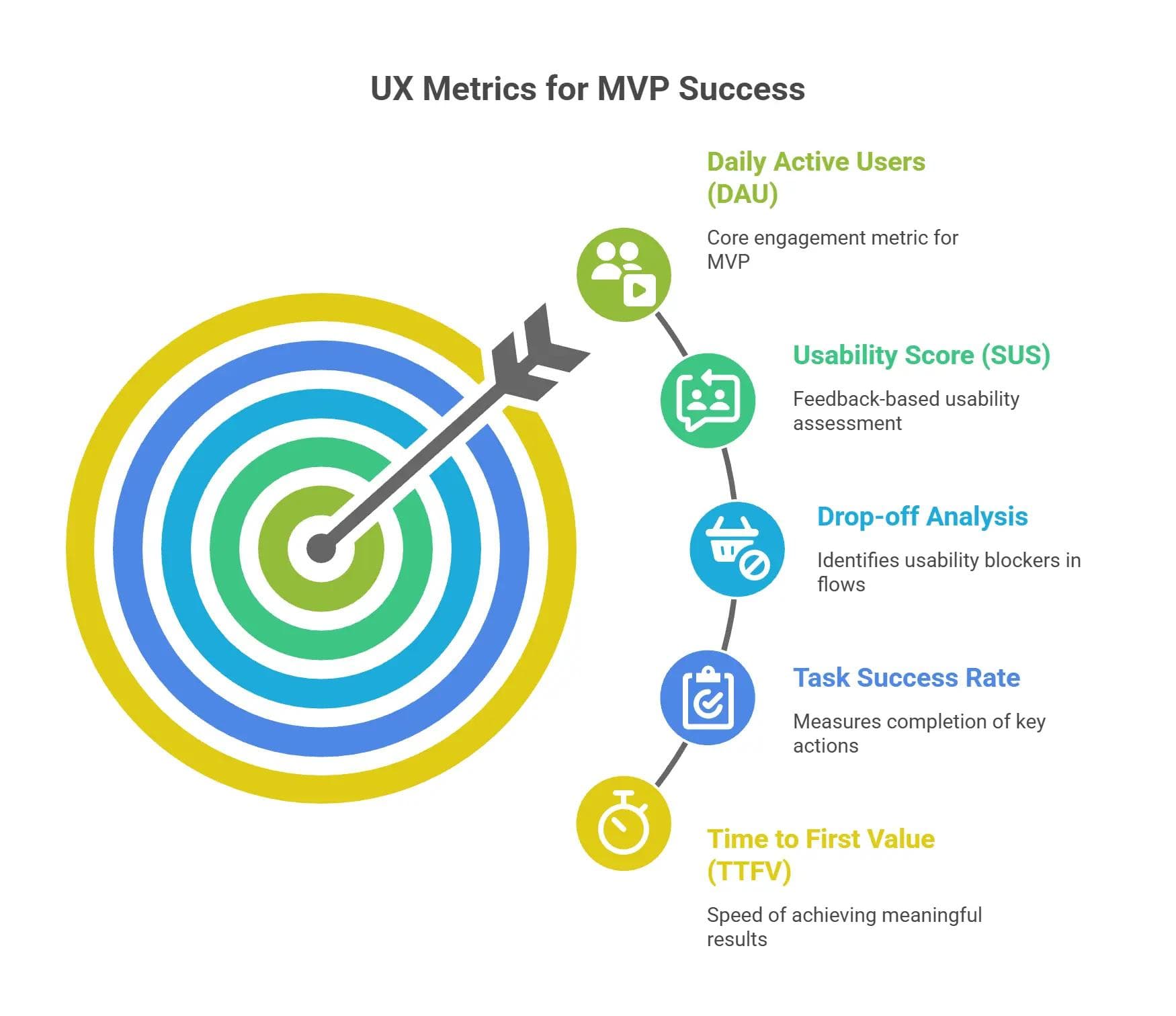
Measuring MVP User Experience Effectively
Unless you quantify it, you will not be able to improve it. And in the context of an MVP centered on user experience, user experience monitoring is not any less significant than technical stability monitoring or feature adoption monitoring. Startups that bet on software UX design measurement early on can iterate more quickly, think smarter, and provide value that users experience.
The point is to go past the subjective views and compile objective data on how users interact with your MVP, what brings them happiness, where they lose their way, and at what point they leave.
Key MVP UX Metrics to Track
With little data infrastructure, there are certain metrics that give you a good indication of the quality of the user experience of your MVP.
Core UX metrics include:
- Time to first value (TTFV): speed of users achieving a meaningful outcome.
- Drop-off points: Where users leave core flows (e.g., when signing up, KYC, transactions)
- Task success rate: What proportion of users do this important flow with or without help?
- Error rate: Number of technical or UX errors.
- System Usability Scale (SUS): Easy questionnaire that gives a usability rating based on user ratings.
Monitoring these metrics will ensure teams prioritize software usability MVP where it is most needed, at the points of the user experience that introduce friction.
Leveraging UX Data for Prioritization
After gathering UX metrics, the next thing to do is to make them translatable into actual decisions. You are no longer limited to using your gut feeling to decide what to do with features, but you can use both qualitative clues and hard numbers to make decisions to update features, design features, and roadmap priorities.
The applications of UX data:
- Replay user sessions or interviews along with quantitative metrics.
- Design a UX scorecard that would allow comparing various user groups (e.g., crypto-savvy vs. beginners).
- Test A/B to determine the flow of UI changes and their contribution to satisfaction.
- Regularly check UX metrics when doing sprint retrospectives or quarterly reviews.
The process is what will give you the feedback loop and keep your user-first MVP constantly improving on the basis of actual, measurable impact, rather than anecdotal assumptions.
The intuition is made into an insight by measurement. Startups that view UX as a quantifiable asset (not a layer of design) can create a product that resonates at first sight, scales with confidence, and keeps getting better. When your metrics are right, your MVP user experience is not just a byproduct of going fast.
To sum up
In a fast-paced world of fintech and blockchain, it is no longer sufficient to make a product that just works. An effective MVP should be intuitive, fast, and trustworthy on the first click. That is the strength of an MVP that centers around a UX product--it is not a conception created after the fact.
With seamless onboarding and a hassle-free way to accomplish tasks, considerate software UX design will enable early users to find value more quickly and with greater certainty. And by investing in feedback loops, lightweight testing, and intentional design decisions, teams aren’t releasing a prototype; they are releasing the building blocks of a product people will visit again.
Regardless of whether you are creating a crypto wallet, a neobank interface, or even a token marketplace, a robust MVP user experience will lay the groundwork for everything thereafter. Focusing on software usability MVP first results in higher retention, faster validation, and higher long-term adoption.
Shortly put: Build quickly, but build with sympathy. Curiosity turned into commitment - and ideas into impact—is best achieved with a user-first MVP.